
Here at the Curse of Muldoon, we are many (2) voices that make one blog. We will not always agree. I like to think we will be a melting pot of takes that will make a hearty, delicious stew. Mikey is a crazy person for his takes on the winter classic. Here’s why:
THE LOGO IS STRAIGHT FIRE

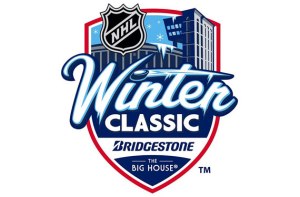
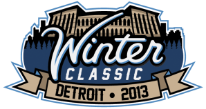
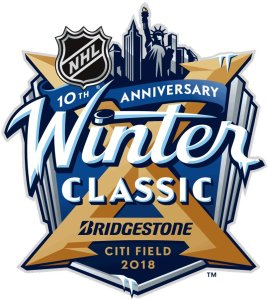
It’s got everything I want in the logo. South Bend, Chicago, and Boston have huge Irish Catholic populations. And since we aren’t going to be putting any overtly religious symbols up for the classic, a shamrock is a great choice. It’s simple and different than the boxy logos of the past. Check out these monstrosities:

When we are looking from a relative standpoint… the 2019 logo seems to be a wild success.
Either way, we are all winners because we get to talk about hockey in July. I’m wildly excited for this game. Winter classics have become somewhat blah to me over the years. But two O6 teams, in the stadium I’ve been going to since I was a little tyke, on new years day… I can’t wait. BRING ON THE ALTERNATE SWEATERS.
Go Hawks,
-Z
