
One of the biggest travesties in the history of mankind was when every lost their third jersey option last season.

That grievous wrong is being righted for the 2018-19 season. Only a handful of teams will be wearing new threads this season, not including Winter Classic/Stadium Series specials. So far the Hurricanes, Coyotes, Ducks, Flyers, and Blue Jackets have revealed their designs. In this series I’ll be going over the new designs of each team, giving my very uneducated thoughts on what I like, don’t like and am indifferent too. I’m not going in any particular order so you’re not allowed to get upset with it. Put on your big boy pants and deal with it. First up: The Columbus Blue Jackets.
The Design:
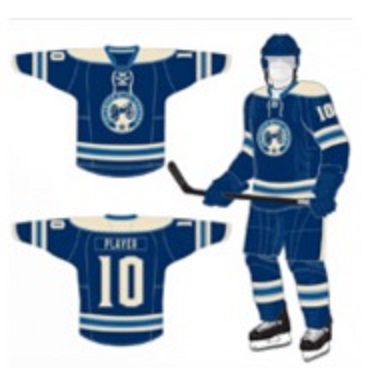
This is not the first time the Blue Jackets have worn this design. It’s the same alternate they sported from 2010-2017. Some might say this is a lazy effort by the Jackets. This was a golden opportunity to come up with something new and original. But you know what? If ain’t broke, don’t fix it. And this design ain’t broke.

I’m a sucker for retro designs and this one hit just about everything on my checklist. It’s simple without being boring. The solid blue sweater blue sweater is accentuated perfectly by the white, grey and blue trim. The shoulder yokes feel a bit heavy on top but I cab live with it. The center crest is also bold without being overpowering. It has a distinct old school hockey feel to it despite the team being less than 20 years old. I could imagine the team wearing these in the 1930s if I didn’t know any better. The cannon on the crest is a nice touch too. They easily could have gone with a star, similar to their primary logo, but I think they made the right decision. The cannon is cool nod to the team’s namesake and unique symbol of strength. Many teams use cannons to celebrate, few put them on their jersey.
There are a couple of minor issues I have with the design. They’re sticking with the same font as on their primary and secondary uniforms which is for sure an upgrade from the Reebok font but still leaves a little something to be desired. Secondly is the shoulder yoke, as I mentioned before. It just feels a touch too big. I wouldn’t get rid of them but I would shorten them up so they wouldn’t go so far onto the sleeve. Overall though, I realize those are minor issues and in the grand scheme of things, they don’t bother me that much.
All in all I like these alternates a lot. Compared against Columbus’ home and away uniforms, I would rank this one far and away their best sweater. If I was a Columbus fan you would have a hard time getting me to take this off. Even as a non-Columbus fan I would consider getting one. When the Blue Jackets had the choice for their third alternates they could have made the right decision or the wrong one. Columbus nailed the right decision.
