I’m not sure if this is an appropriate time to blog about the Carolina Hurricanes but they did release one of the sickest new sweaters this off season and I am blown away.

But in all seriousness, speaking without hyperbole I might have to invent a time machine, go back in time and force my parents to move to Carolina when I was a child so that I can become a life long Canes fan and wear this sweater everyday for the rest of my life until I am buried in it.
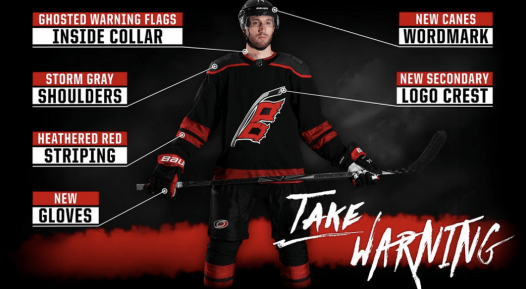
These new sweater have an elegant simplicity to them. The Hurricanes picked three colors that work together and didn’t try to get to cute with them. Almost anything goes well with black but red works especially well. The black primary with the heathered red striping was the right decision as well, red primary with black striping would have been much too in your face. They were also wise not go overboard on the striping, keeping it to elbows and hem. It leaves plenty of room on the front for the secondary logo to breathe.

Speaking of which, I like the use of the secondary logo. The Hurricanes primary logo feels too amorphous. The warning flags are a more relateable image and it feels more aggressive than than the hurricane. The primary logo is ghosted out on the storm grey shoulder pads but I have no problem with that. It was worked into the design in a way that doesn’t distract or take away from the rest of the sweater. It’s cool having there with the state flag on the other shoulder, a nice local touch.

In addition to the flag there are a few other cool details. The inside collar features a warning flag pattern and the red striping has a much more detailed look up close. Little details like that mean a lot. It’s a very cool nod to the region and it makes it easier for fans to connect with the team. It’s a cool reminder that these guys, from the front office to the players to the equipment interns, are part of the local area. It helps demystify professional athletes.

Or it’s just a really great marketing ploy. Either way, it’s a damn cool design. 5 out of 5 Katrinas.
